The web has long been the number one resource for students seeking information about a college. In 2020, this fact became more pronounced than ever, with students compelled to use the web to replace in-person visits, information sessions, and general fact gathering in their college search processes. The web took center stage as the virtual home for admissions.
As Spark451’s design group, we constantly reflect upon the essentials for successful university websites that are prospective-student focused. There is so much to consider when managing a website, and you can’t skimp on anything. From responsive design to SEO, and content strategy to accessibility, it all matters. As the COVID-19 pandemic hit, colleges and universities were forced to think differently about how they engage with prospective and current students in the digital space. It is in this spirit that we are offering this overview of key higher ed web trends you should be aware of in 2021. Our aim is to prepare you for the unexpected, and to help ensure that users anywhere and of any background can rely on you to give them the information they need to make a great college choice.
Trend 1
Drag-and-Drop Builders
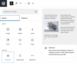
Across the web, more visual and intuitive ways of creating content have become increasingly popular. With the WordPress 5.0 release in early 2019 came a block editor called Gutenberg that completely changed the website editor experience. The technology was slow to be adopted, but in 2020, it went mainstream with a new release and a more robust library of components. Thanks to this drag-and-drop page builder, the building experience is more user-friendly than ever. It offers content managers the opportunity to build their websites without expert knowledge of coding. A version of Gutenberg was also ported to Drupal to compete with the native (and less flexible) Layout Builder within Drupal 8.
How does Gutenberg work? All the content is divided up into individual “blocks.” Gutenberg has many different types of blocks, such as headers, quotes, lists, galleries, and so on. Add-ons like ACF Blocks Suite offer a comprehensive collection of ready-to-use Gutenberg Blocks to help you make a beautiful website.

When you’re faced with unexpected changes or having to add completely new sections of content, a drag-and-drop builder is an easy, visual solution to get your pages up and running in no time. And while we won’t be getting rid of field-based content management any time soon, drag-and-drop builders let us create media-rich landing pages with speed and ease.
Trend 2
Content Is Still King
Users come to your site for a reason: the content! And when it comes to managing that content, you need a strategy. In the COVID era, we shifted our focus to bring events online and create compelling content for live interaction. Many of us even became broadcasters for the first time, mixing live video streams with slides and films into our Zoom meetings and webinars to get our messages across. And if you haven’t done that, you certainly will need to for the better part of 2021.
Another major content trend for the year ahead is the repurposing of existing video content to create new interpretations for shorter snippets and social stories.
And of course, many of you discovered that your site wasn’t as easy to use as it could be, so you had to rewrite and reconfigure your admissions section to be more usable and reader-friendly. (We often use tools like the Hemingway Editor to write more accessible, readable copy that aligns with a ninth-grade reading level.)
Finally, web personalization is becoming even more important in 2021 as students look for colleges that have their needs and interests in mind. We build personalized microsites to help admissions offices build even greater connections to students.
Trend 3
The Need for Speed
In many ways, web design is a balancing act. You want to have beautiful pages with compelling video, breathtaking images, and sophisticated typography, but you also need to ensure the pages load quickly.
In mid-2018, Google began to roll out a “speed ranking” for both mobile and desktop searches. In essence, if your pages were not fast, your page would not rank high on Google searches. This is an existential threat for colleges that rely on Google for up to 80% of their inbound traffic. (To check your site’s speed, go ahead and fire up the Google Lighthouse tools.)
Of course, prioritizing speed isn’t just about Google rankings. If your page doesn’t load quickly, the viewer will act fast and move on. The average human attention span dropped from 12 seconds to eight seconds in 2018, so we have to keep those load times short!
12 SECONDS
The average attention span of a human in 2000
8 SECONDS
The average attention span of a human NOW
Erik Runyon of Notre Dame did us the favor of analyzing the fastest home pages in higher ed. How does your site stack up?
Trend 4
Design Innovation
Web designers are always innovating, bringing novel content structures and components to your pages to elevate the experience for prospective students. Here are a couple we think are important for 2021:
Parallax Scroll Animations – These keep your page dynamic, layered, and engaging, and they’re so simple! Nobody wants to read a wall of text, so mixing in some images helps divide up content and provides some visual interest.
Secondary Navigation: Menu Takeover – Less is more, as they say. The less “clutter” you see in your primary navigation, the better. This menu takeover gives you the opportunity to decrease primary navigation clutter and create an engaging, interactive navigation experience.

Negative Space Is Actually Positive – OK, this isn’t really new, but it’s worth repeating. Adding negative space to your designs highlights your newly finessed content so that it is easier to read and understand.
Trend 5
SEO Awareness
If you build an amazing website, but its content doesn’t show up on search engines for important keywords, does it really exist? How can I show up for searches that don’t include my college’s name? These are the questions you will need to answer in 2021, as competition heats up to capture the attention of people who are searching online for undergraduate and graduate education opportunities.
SEO is yet another example of the web design balancing act. We want to give our writers the freedom to use their talents to best express our spirit and quality, but we also have to ensure that what they write can also be appreciated by Google’s web crawlers and machine learning algorithms. It starts with “technical SEO,” which means getting everything right in our code—from semantic elements to proper meta data structure—and extends into the content manager’s domain.
Keyword research helps us understand the words we need to target, and comprehensive knowledge of web standards helps us use those keywords with the proper emphasis for the search engines. (For example, be sure to use your most important keyword in the <title> tags and <h1> tags.) SEO is an expert’s game that can be learned, and we are here to help for those in need.
Trend 6
Power to the Pixels: Conversions, Retargeting, and Tracking
With recruitment and registering online becoming the norm, the ways in which we keep track of those interested users must change. You want to know when someone visits your website and how they interact with it. Maybe they’re interested in learning about your institution or the nursing degree you’re well known for, or perhaps they came to learn about an event you’re hosting that was shared on social media. In these cases, you want to be able to follow up with those visits and clicks to make sure users are getting the information they need and seeing what makes your institution stand out from the rest. That’s where pixels come in.
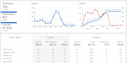
A pixel is a tiny, invisible digital marker that is placed on your website in order to keep track of a user’s movements throughout. Not only can it tell you how they got to your site in the first place, but it can tell you:
- The time of day they visited your website
- Their locations
- New or recurring visits
- What browser they used
- The type of device they used (desktop or mobile)
- And more…

With this type of information, you can learn more about what your users are interested in and make smarter marketing decisions. Ultimately, you’ll take these learnings to optimize your digital ad spending so you can avoid focusing on ineffective marketing campaigns.
Trend Imperative 7
Accessibility
We anchor this blog post with the topics of accessibility because, without it, nothing else matters. It is not a trend, per se, but a responsibility and, doggone it, it’s the right thing to do! Equity and access are part of our national discussion on higher education and those ideas reflect the foundational values of our colleges and universities. Everyone belongs on our campuses, and everyone deserves to be able to access our content. Of course, these values are codified into law in Section 508 of Rehabilitation Act, which states that any entity that receives funding from the federal or state government must meet WCAG 2.0 AA accessibility standards.
According to w3.org, “web accessibility means that websites, tools, and technologies are designed and developed so that people with disabilities can use them.” Many colleges have been slow on the uptake of accessibility, but are catching up in 2021 and beyond. Part of the reason accessibility has been tough for designers is that it requires some tradeoffs that may be difficult to follow. For example, some schools have had to use a different shade of their school colors to increase contrast (for color-blind readers), or cut back their use of JavaScript widgets that just can’t be navigated through voice.
At Spark451, we have redoubled our efforts in accessibility, standardizing our approach around the Axe Accessibility testing tools, and adding screen readers and keyboard navigation to our testing process.
In Closing
2020 was a disaster in many respects, but certainly not for higher ed websites, which stepped into the spotlight as the indispensable tools that they are. We wish you the best of luck in using your website to serve your student populations in realizing their higher education goals. And if you should find yourself in need of a web design partner, you know where to find us.
