North Central College
Meeting Generation Z Where They Are
Redesigning a college website for content-hungry students.
Overview
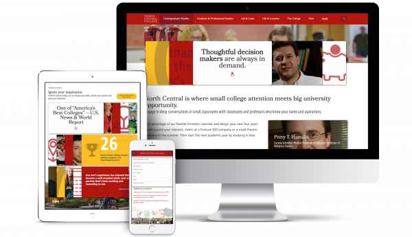
To transform North Central College’s website, Spark451 took cues from digital platforms prospective students use every day. Our design, development, and content teams collaborated with North Central College for more than a year on the award-winning site, which launched in December 2016.
Using the content management system Drupal 8, we devised technology solutions to create an interactively-rich experience that is easy for North Central to maintain. The result is a user-centered recruiting channel that stands apart from other college and university sites.
Gaining students' interest in a way that prompts them to apply and enroll was priority number one.
Setting the Bar
We started the project by working with North Central, a liberal arts school near Chicago, to identify key goals. For example: What must the new site do in order for the project to be a success?
Gaining students’ interest in a way that prompts them to apply and enroll was priority number one. A related aim was improving the experience of finding and digesting information that is critical to the decision-making process. This information may include the majors students can select, the learning environment, how to apply, and financial aid availability.
In order to achieve these goals, we began by understanding our primary users’ (junior and senior high school students) online expectations and behavior. We asked current North Central students what sites they use most. Spotify, Netflix, and Amazon were mentioned frequently. They noted Instagram and Facebook, as well.
Research shows that Generation Z users prefer communicating with images more than with text, which might be a reason for the popularity of image-driven sites.
Most university and college websites lack the ease of use of these popular websites. Content is often buried on higher-education sites, rather than surfaced to highlight what’s interesting or useful in context of where a user is within the site.
Many higher-ed sites also offer a strikingly similar visual look. A hero image, tagline, news, and events take up most of the homepage real estate. North Central expressed its excitement and need to distinguish itself from such sites.
The Invention of ‘Stacks’
Our team dug deep into the platforms students use most to find common features. Many of them package content into bite-sized units called cards. Think of a Facebook post. The format is generally the same: image, headline, and snippet of copy.
A reliance on images over text is also a notable characteristic of the sites students spend their time using. (Research shows that Generation Z users prefer communicating with images more than with text, which might be a reason for the popularity of image-driven sites.)
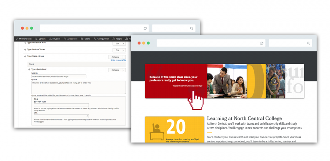
Spark451 singled out those features to develop the concept of “stacks.” Stacks are groupings of cards used throughout the site that animate to reveal images or text when the cursor touches or hovers on them. When users select a card, they’re taken to more information, such as a program page or a professor’s profile.
To accommodate the types of content we identified as being vital to achieving project goals, we created 18 different cards. They include program (for majors and minors), people (faculty and staff), call-to-action, quote, gallery, and article, among others.
Cards feature minimal text crafted so that users can scan the site for the information they want. Editors can also use cards to present compelling content that students might not know to seek out.
Stack types help North Central’s editors determine which cards to use for a particular page or content type. For example, for majors, there is a stack type called “program,” which includes a pre-defined selection of cards that align with the content strategy for the program content type. Editors simply choose the cards they want and enter the data or graphics as if they were filling out an online form.
The victory of stacks is that North Central has the freedom to quickly and strategically promote and update content. As they do, the quality and consistency of the user experience remains high.
41 to 9
Number of content types reduced.
8K to 3K
Number of pages reduced.
Architecting the Site
North Central’s old site was built on Drupal 6. For efficient transition and maintenance, it was important that the new site also use Drupal. As the project kicked off, a new version, Drupal 8, was being released. It was essential to North Central that the agency it selected had the expertise required to work through the inevitable challenges of a new version.
“We partnered with Spark 451 and challenged them to create a bold vision for our new website and they certainly delivered. Spark 451 worked incredibly hard to make this happen and I believe this site has raised the standard for higher education websites.”
— Christopher Jones , Director of Web Communications, North Central College
Our engineers have extensive experience with Drupal’s core modules and extending or creating new modules for higher education sites. Our designers and content strategists also understand Drupal’s capabilities, which helps us collaborate across teams through every stage of a project.
As we refined the interactive and content aspects of stacks, Spark451 engineers began selecting the modules that would make stacks and the rest of the site function as intended.
What stacks are to the front-end user interface, the paragraph module became to the back-end. It is fundamental to the technical architecture.
The paragraph module allows content to be broken down into discrete units, rather than lumped together in a big body field. That was exactly what we needed to execute the design.
The engineering team mapped the elements of the various card and stack types, as well as other site components (headers, teasers, media, and copy blocks), to build the content types editors create and manage.
Making everything sing is Angular 2. We used a progressive decoupled approach to marry the Angular 2 framework with the Drupal 8 theming layer in order to make the complex interactions the design called for come to life.


